
Ponchlin
CASE STUDY//
BRANDING + PACKAGING DESIGN//
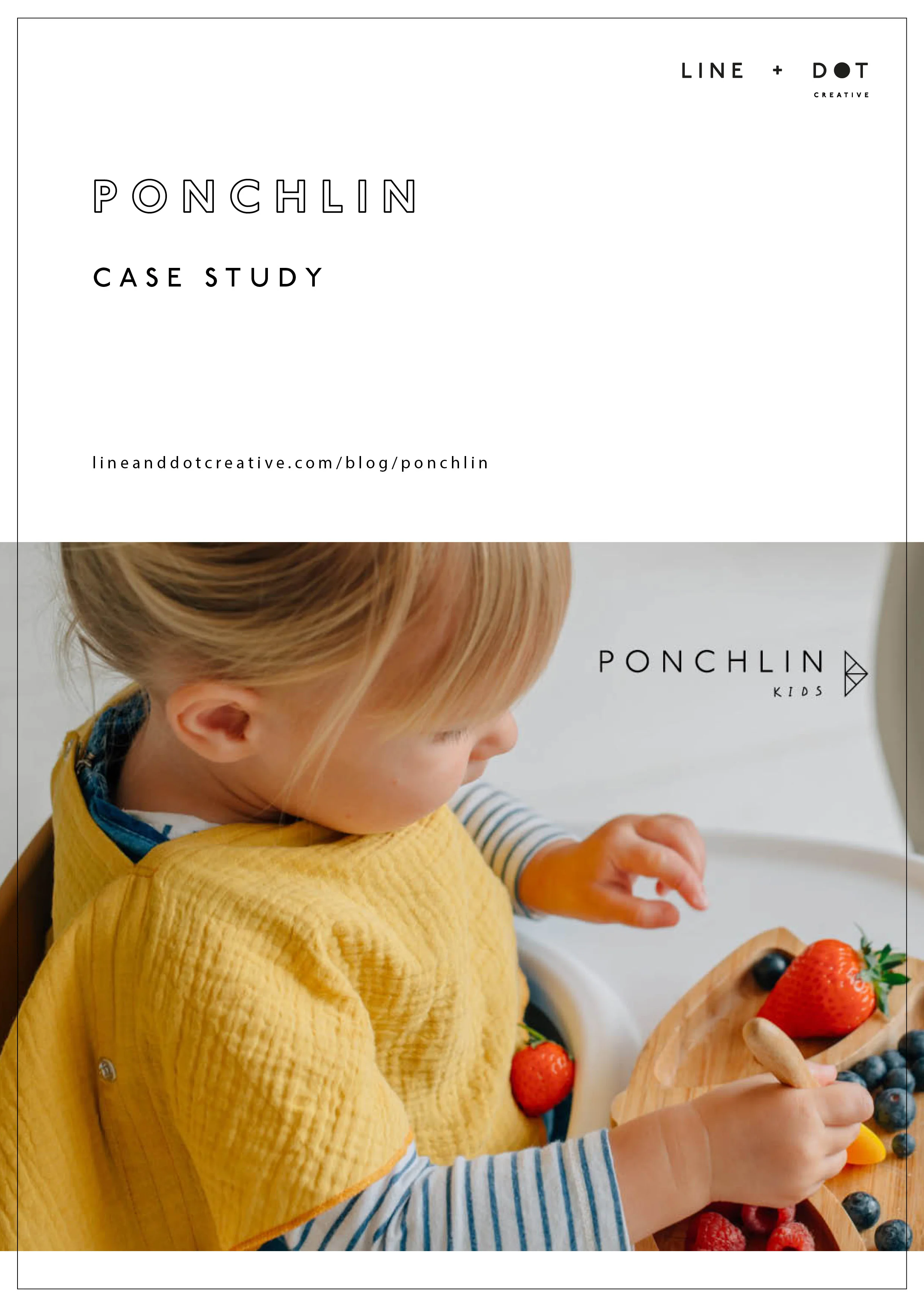
Ponchlin is a multifunctional scarf for kids and mums. I loved working with Susanne on the branding and packaging of her product, teaming up with Illustrator @Camisssao to tell the brand story. Ponchlin inspiration came from Scandinavian minimalism which we reflected through the branding.
Logo + Brand Development//
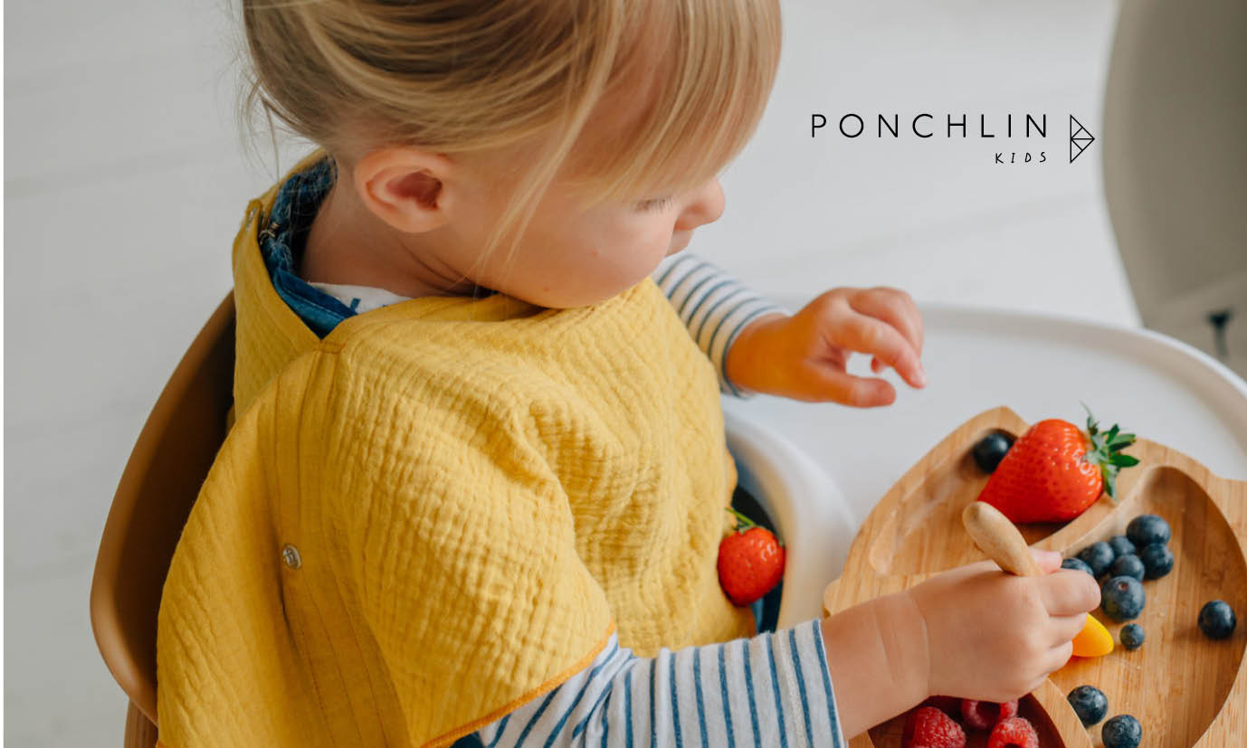
The brand solution needed to be timeless, minimalist and be flexible enough to be used across kids and adults ranges.
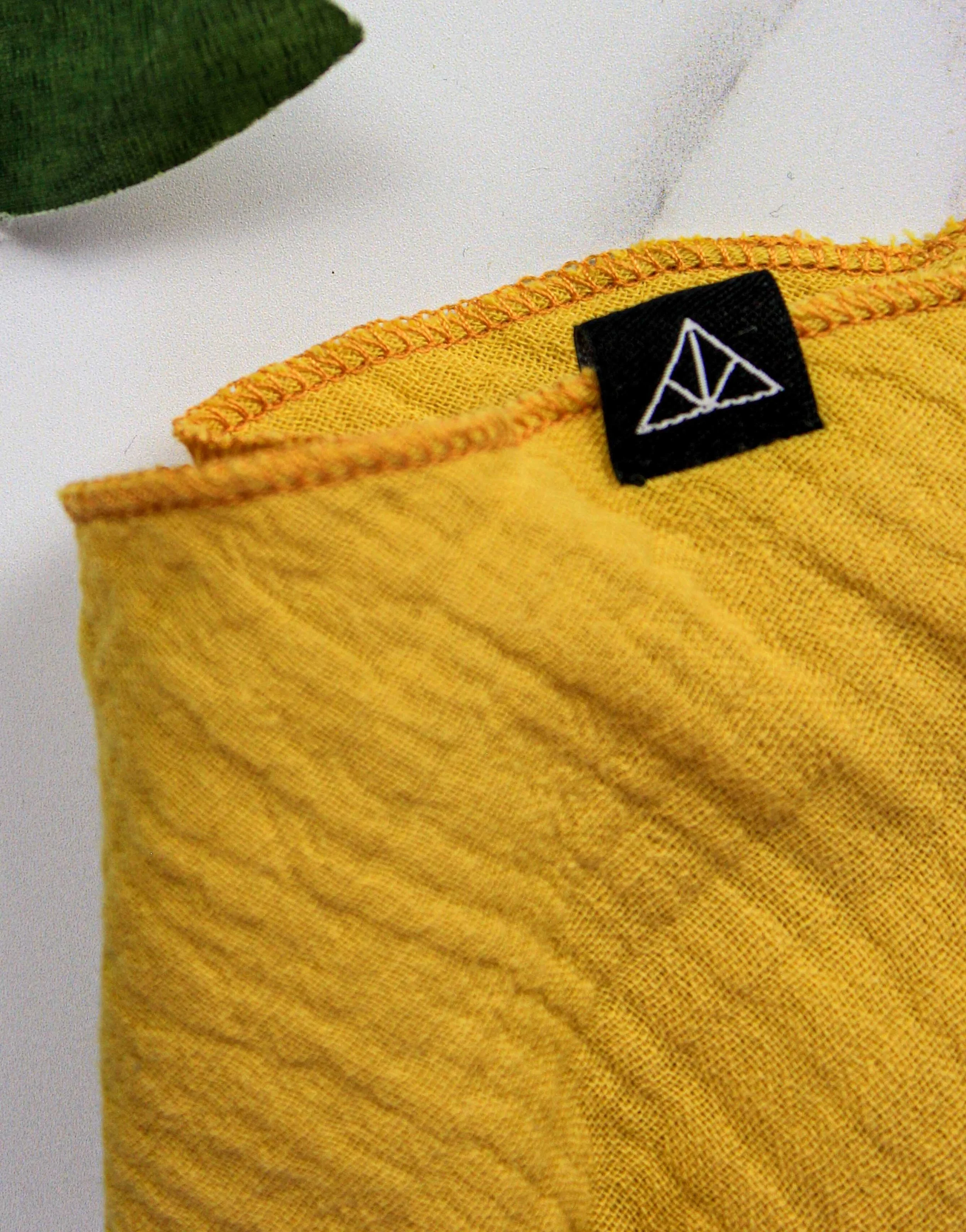
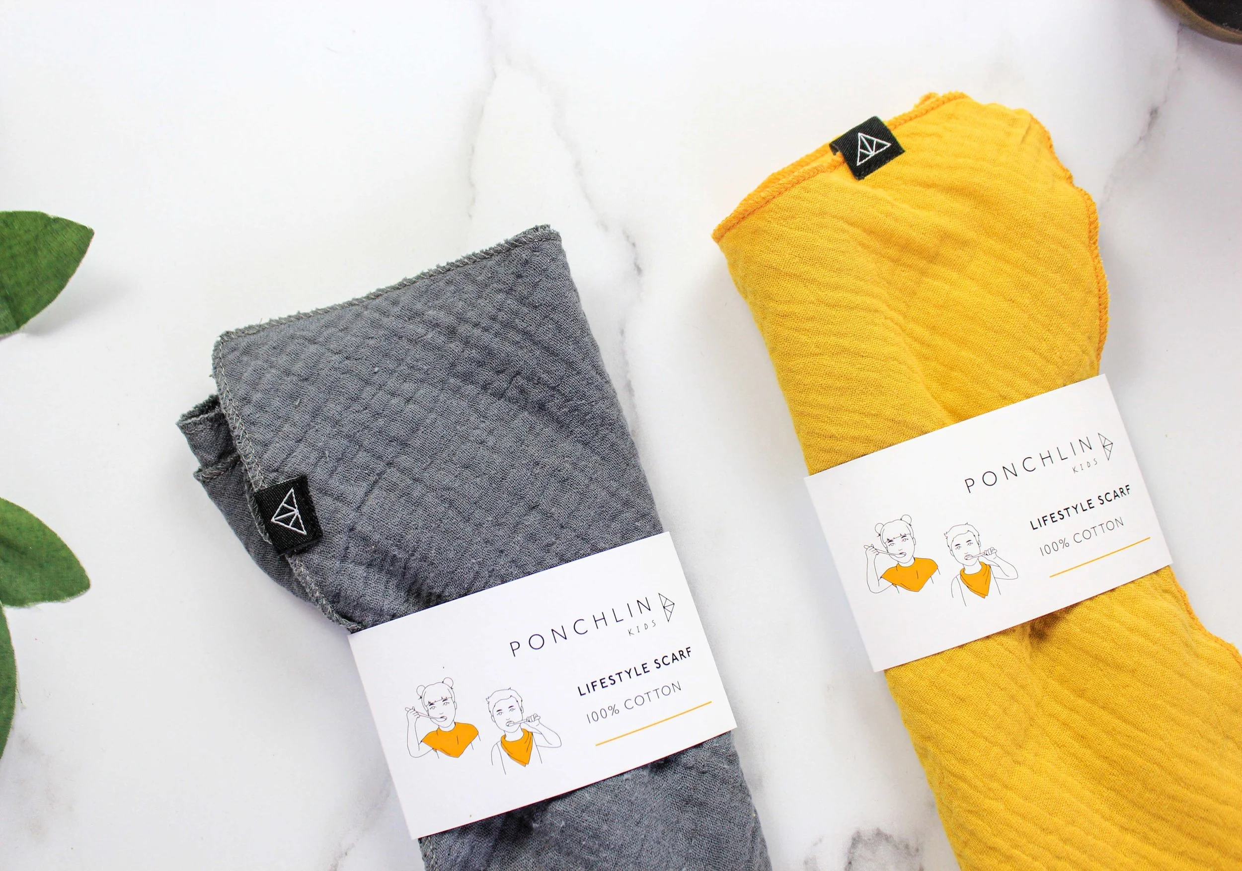
WOVEN EXTERIOR LABELS ADD BRANDING TO YOUR PRODUCT
1// LOGO
A simple sans font logo was developed with hand drawn ‘KIDS’ tag line.
2// ICON
To show the multifunctional use, we developed a triangle with various lines. The icon can be pulled out for woven tabs for the product and also as social media icon - giving brand consistency online and offline.
3//STYLE GUIDE
We created a style guide outlining fonts, brand colours and logo usage.
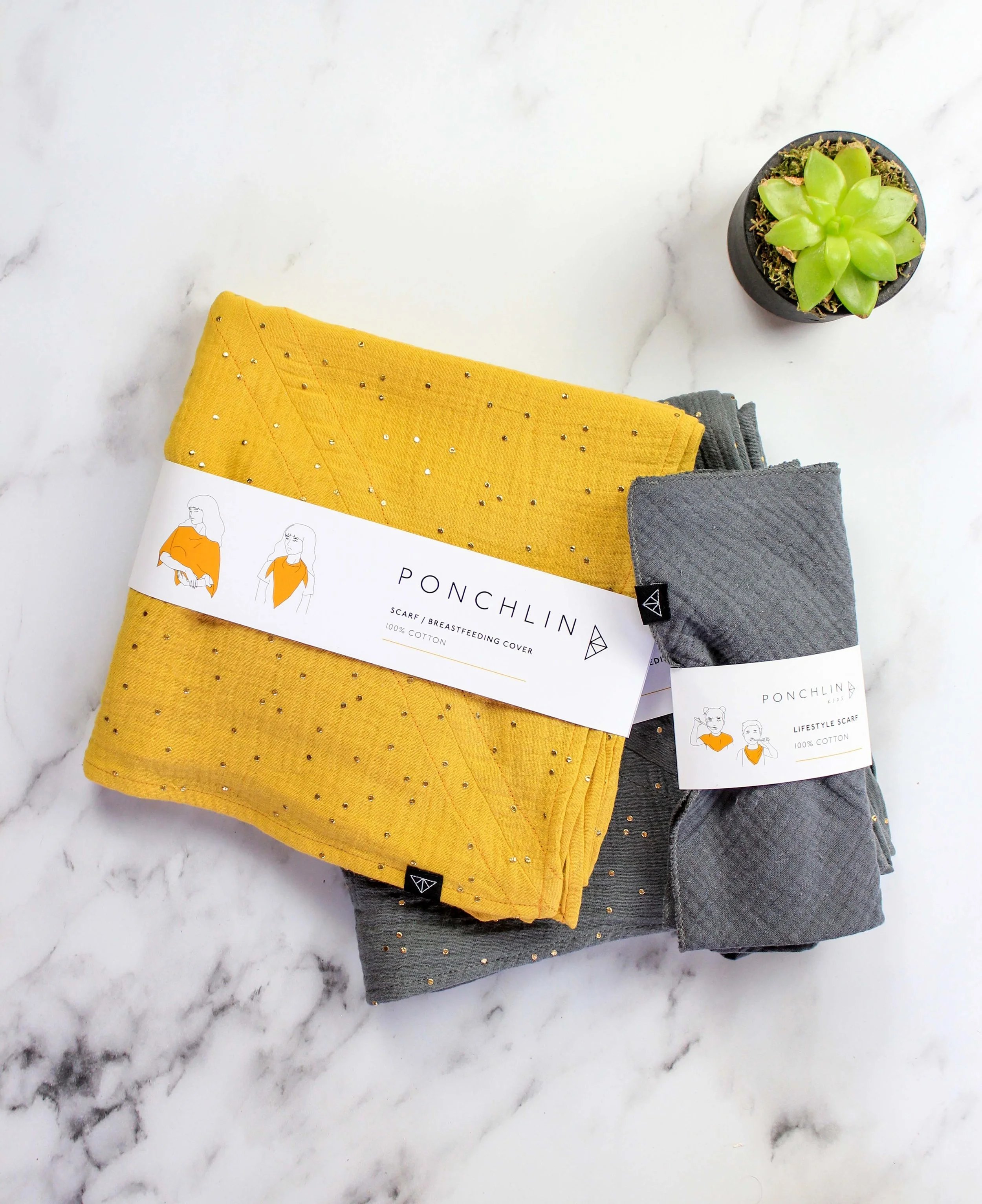
packaging Development//
We decided on a simple wrap band for the packaging using the Ponchlin colours - black, white and yellow. It allowed the product to be on display as well as have the option of touching the lovely textured fabric.
Illustrator Camissao developed illustrations to show the multiple usage of the products as reflected through the drawings of children brushing teeth and the different ways mothers can wear the scarf.

ALEX OF LINE + DOT AND SUSANNE FROM PONCHLIN
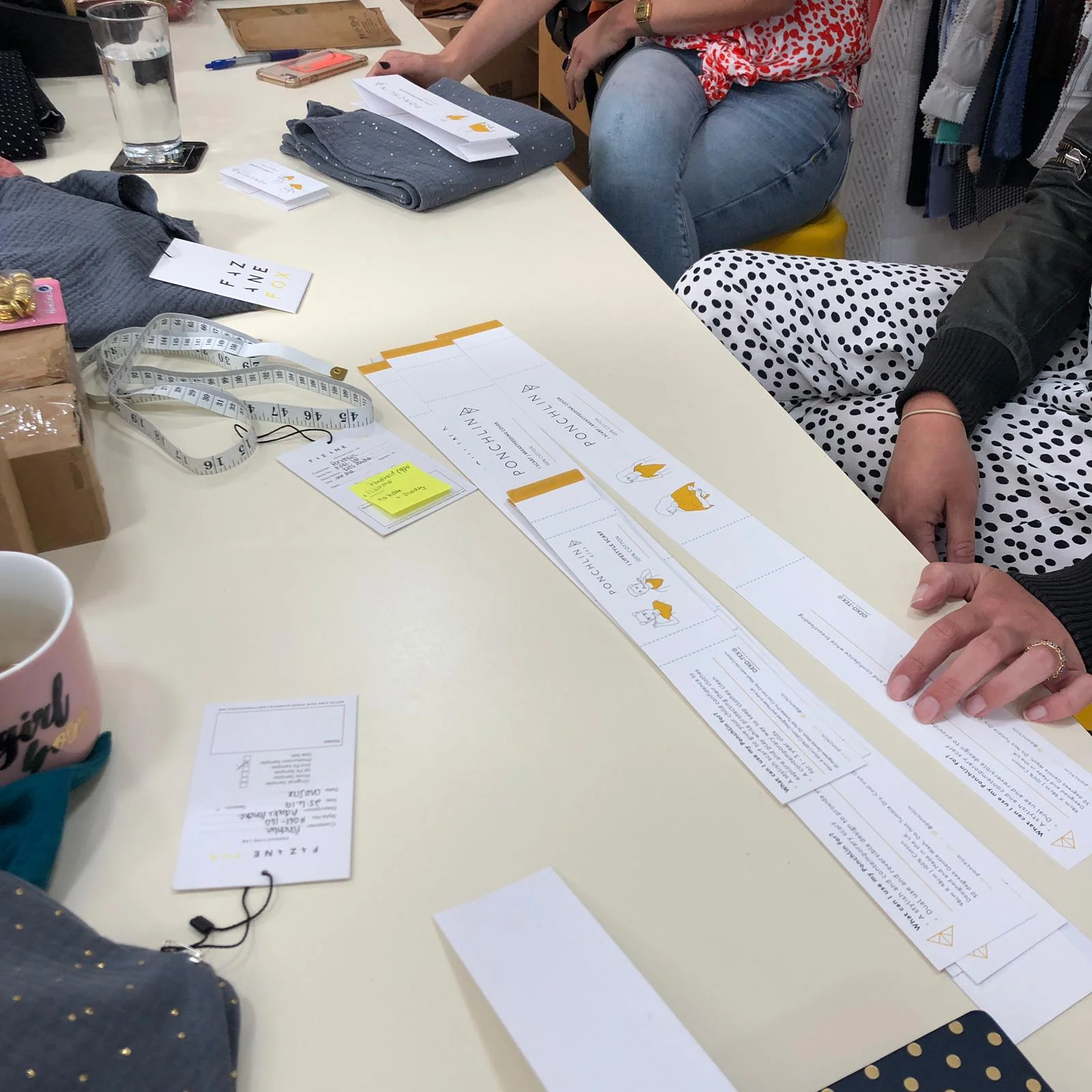
DEVELOPMENT DAY AT FAZANE FOX
FINAL KIDS WRAP BRANDS
Do you need help with your branding project?
Call, email or fill in the form below for a free 30 minute brand consultation.